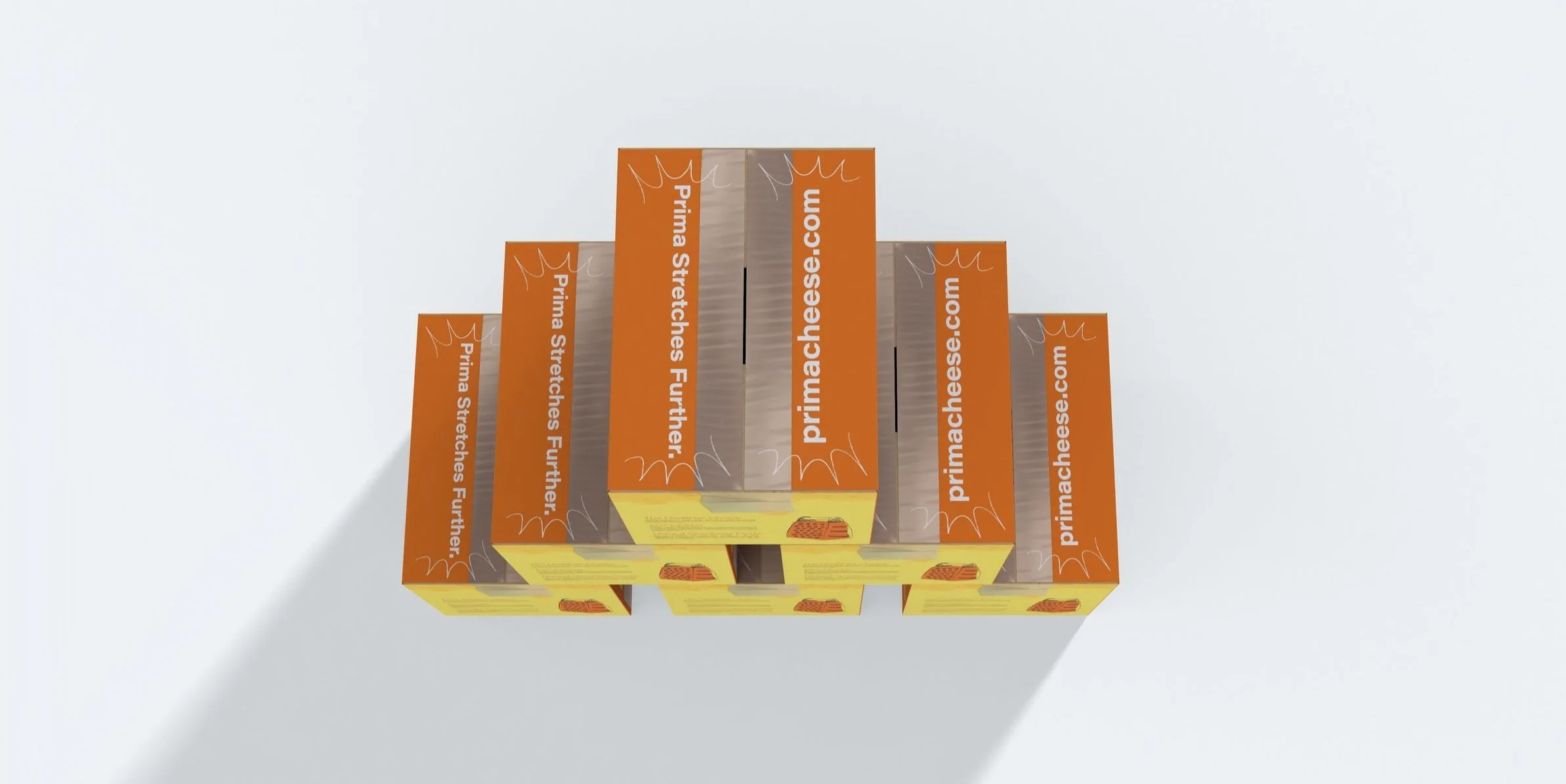
Sustainable Packaging Design
Cheese production is a significant contributor to greenhouse gas emissions, and Prima wanted to change that with a 100% carbon-neutral product.
My challenge was to design packaging for Prima’s new product, incorporating Prima’s well-established brand but also integrating cutting-edge sustainable materials and engineering, tailored specifically for the B2B market.
CLIENT
Prima Cheese
MY ROLE
Packaging Design
IllustrationsINDUSTRIES
B2B Food ManufacturingLOCATION
London, UKProject Scope
The goal is to create a packaging design that reflects their eco-conscious values, while keeping the playful, vibrant energy of the brand alive.
Every detail, from the hand-drawn illustrations to the carefully selected colours, was crafted to reflect Prima’s playful yet eco-conscious identity.
Sustainable Design
For Prima Lite’s packaging, sustainability was at the core of my design choices. The following measures were taken to achieve our goal:
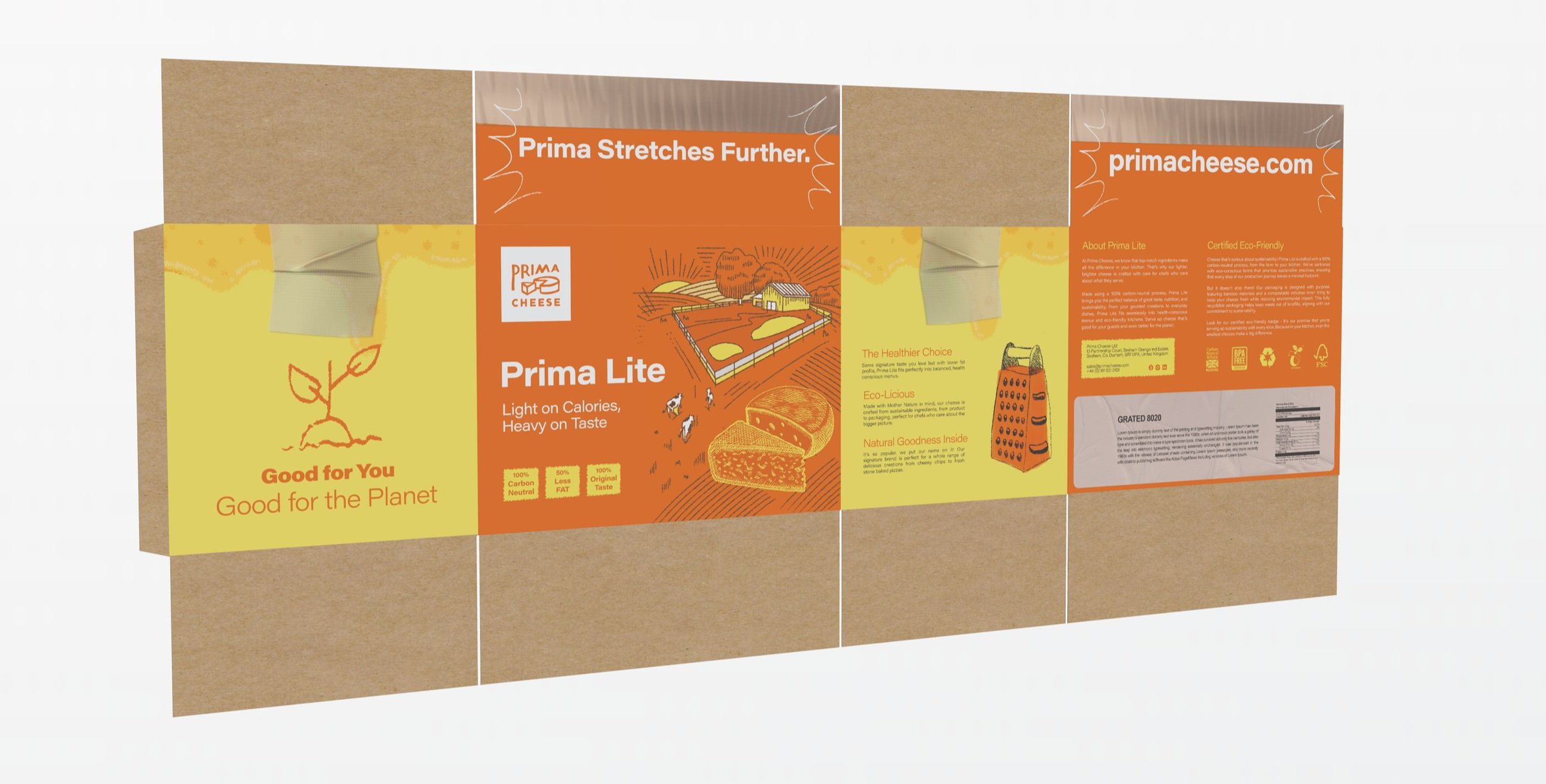
Bamboo outer packaging: Fully bio-degradable, cost-effective and light.
Cellulose inner lining: Compostable, plant-based and helps maintain the cheese’s freshness.
Soy-based inks & sugarcane adhesive labels: Ensuring 100% biodegradability across the entire package.
Tell a Story, Nature’s Story
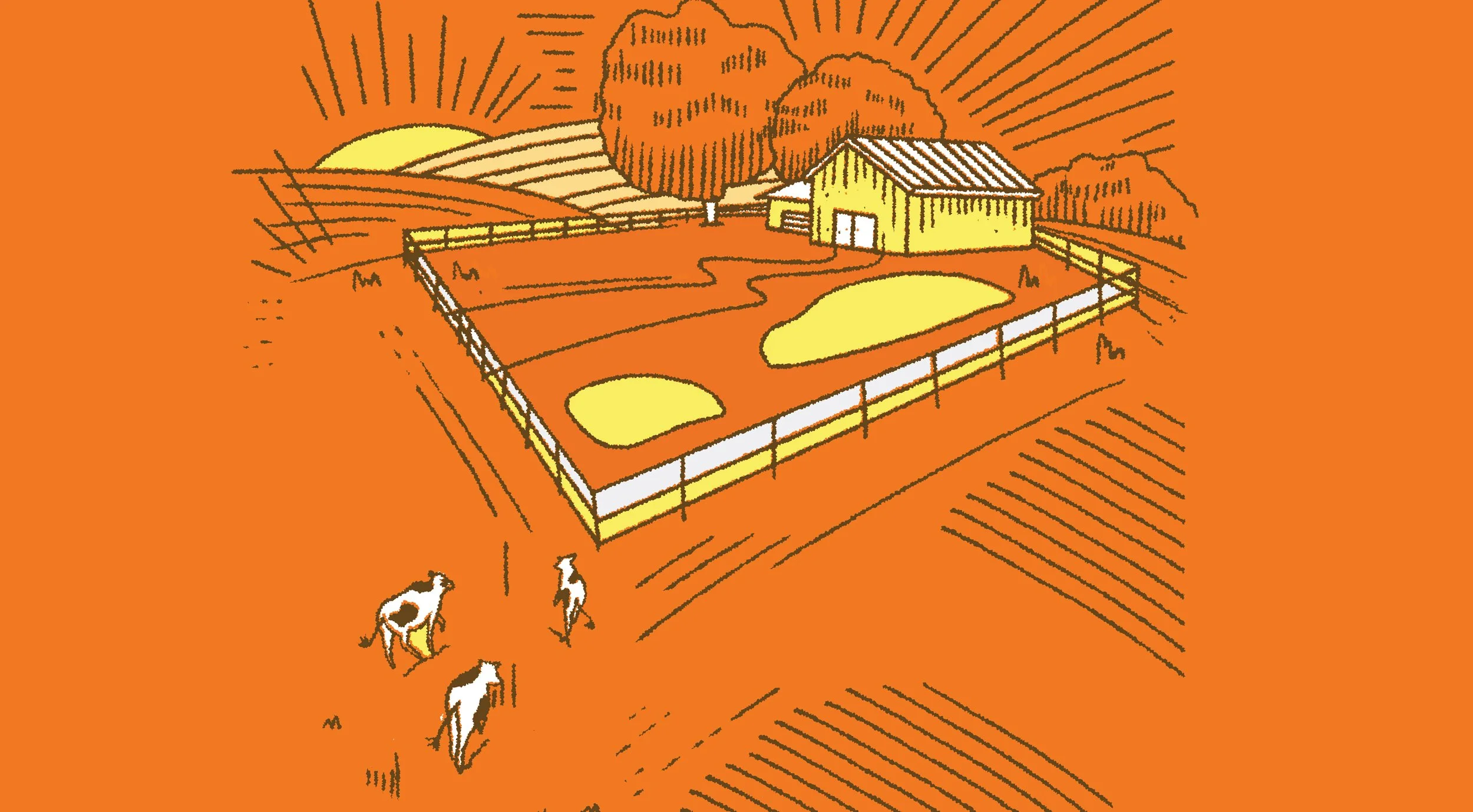
I’ve chosen to depict farm and nature-based illustrations to keep the brand story of Prima Lite at center stage. These visuals highlight our connection to nature, eco-friendliness, and the natural origins of our ingredients.
Each hand-drawn illustration brings the design to life, adding a touch of personality that’s both engaging and memorable.
Packaging Models
Model Orange
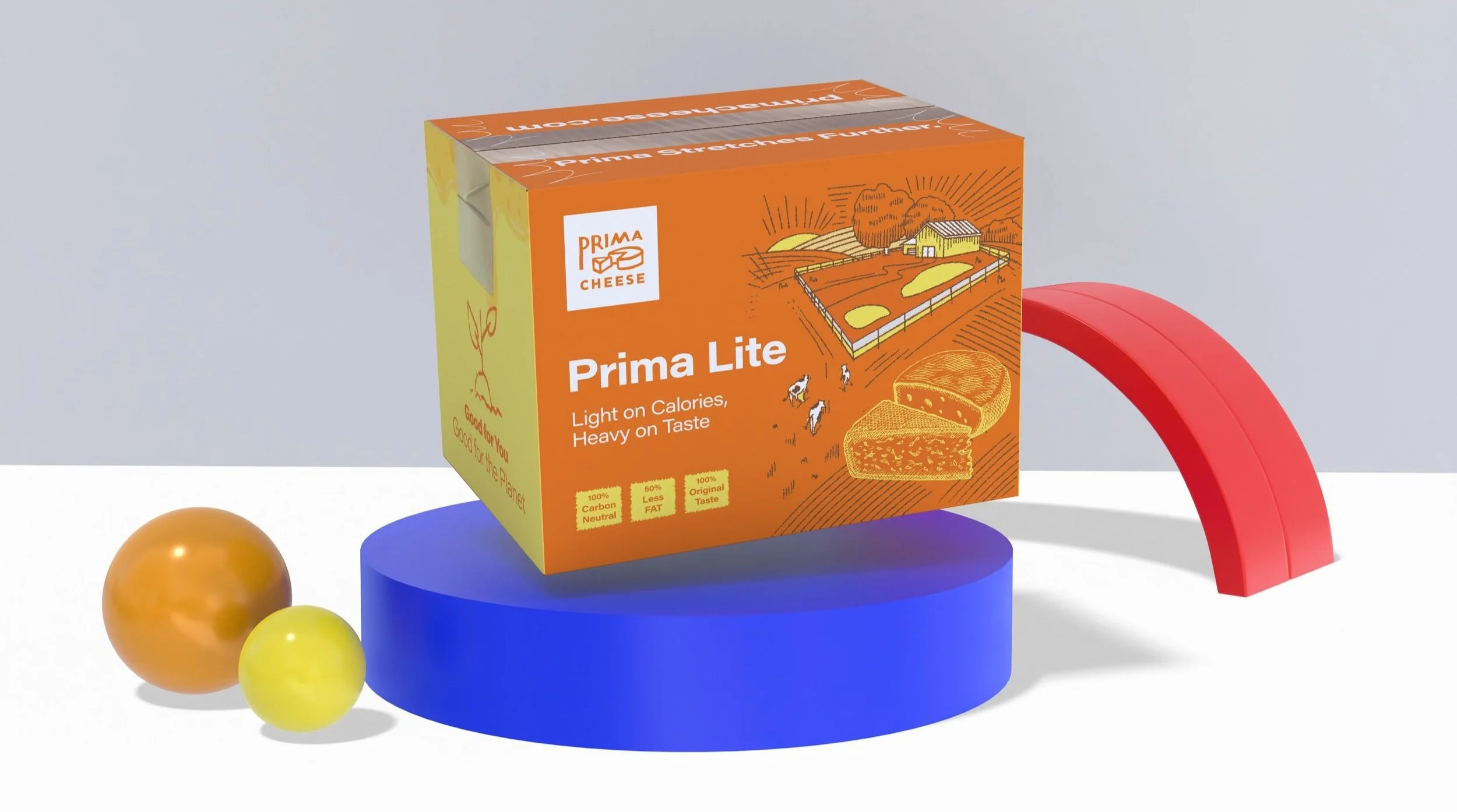
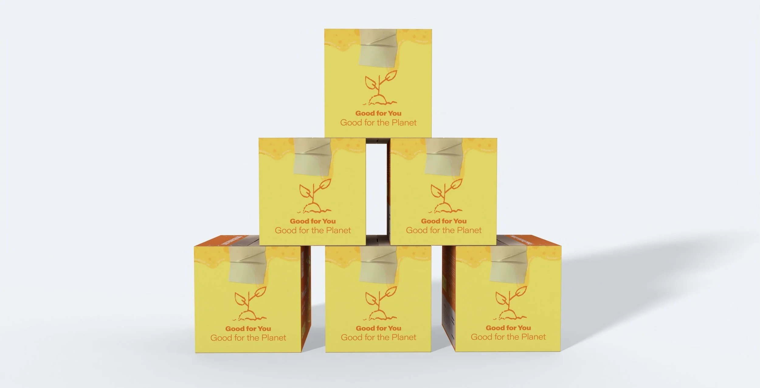
A bold and bright design, perfect for standing out in a wholesale environment. I balanced the eco-friendly materials with Prima’s signature orange colour, ensuring the packaging was both sustainable and eye-catching.
Model Eco
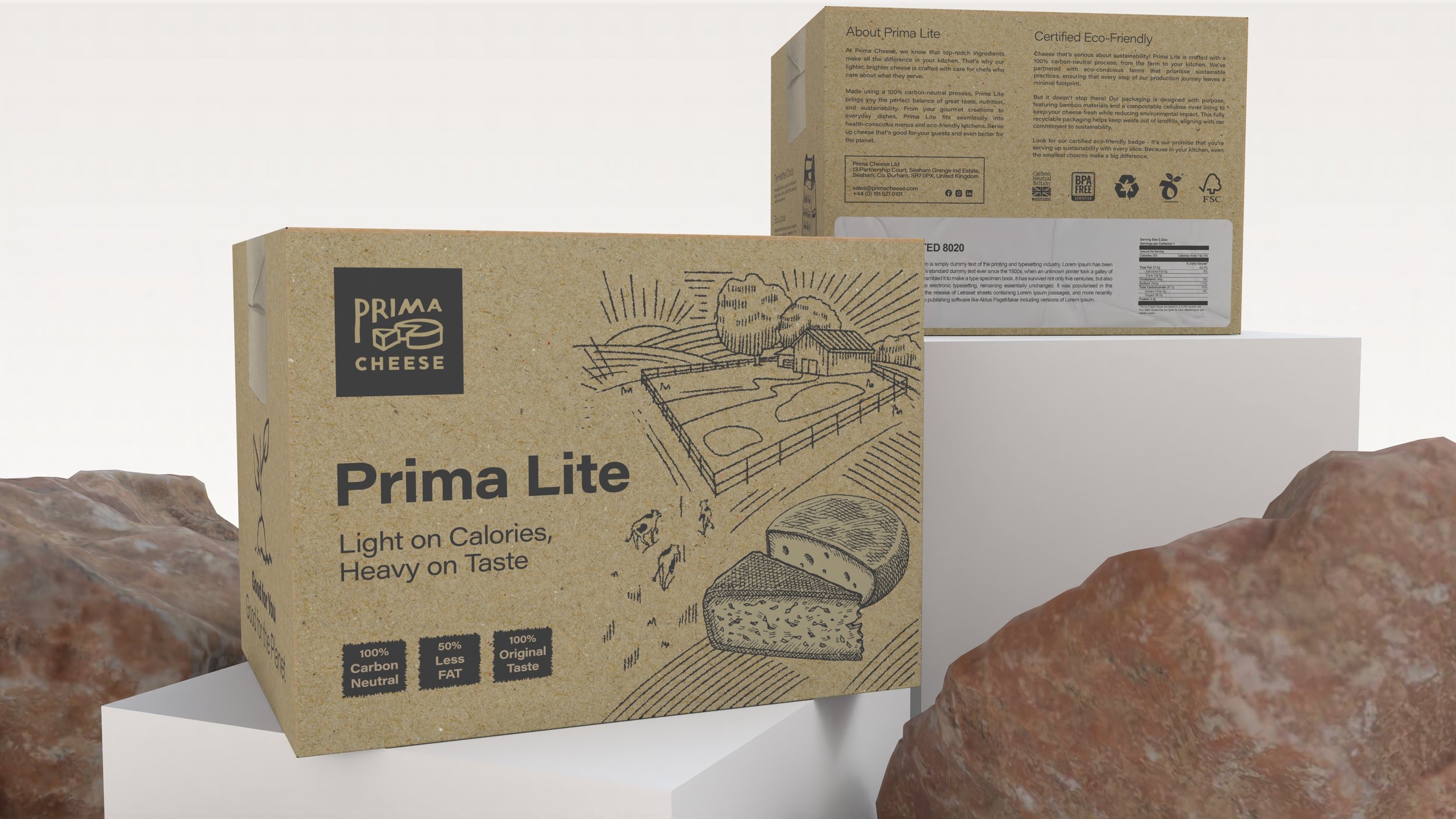
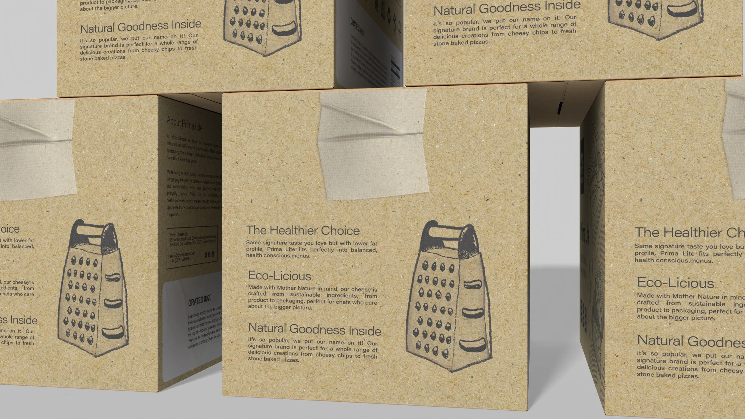
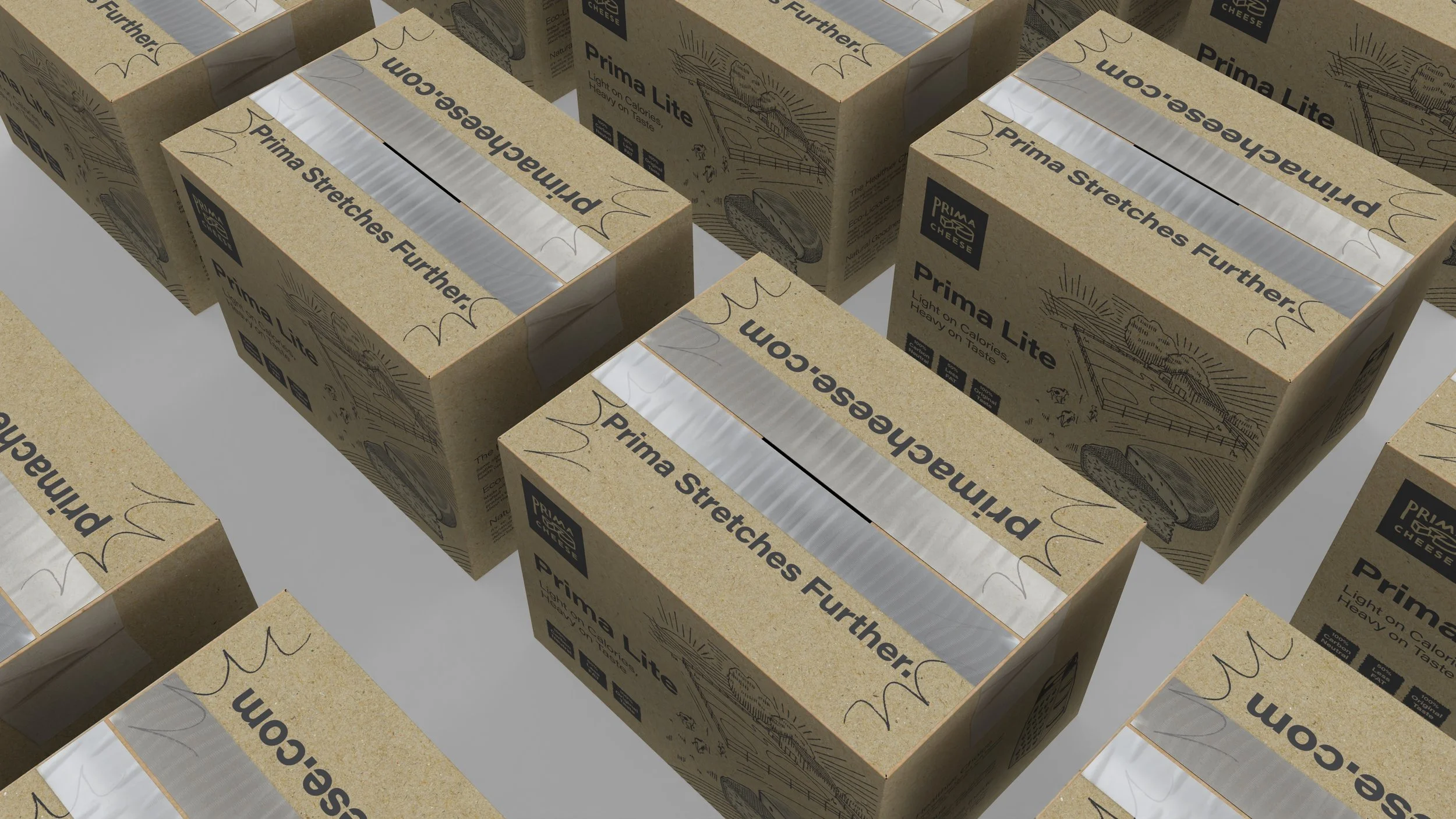
This version takes sustainability to the next level by using minimal colours. By going monochrome, we reduced ink usage and focused entirely on natural materials. It’s a raw, earthy look that reflects the purity of Prima’s mission.
Model Teal
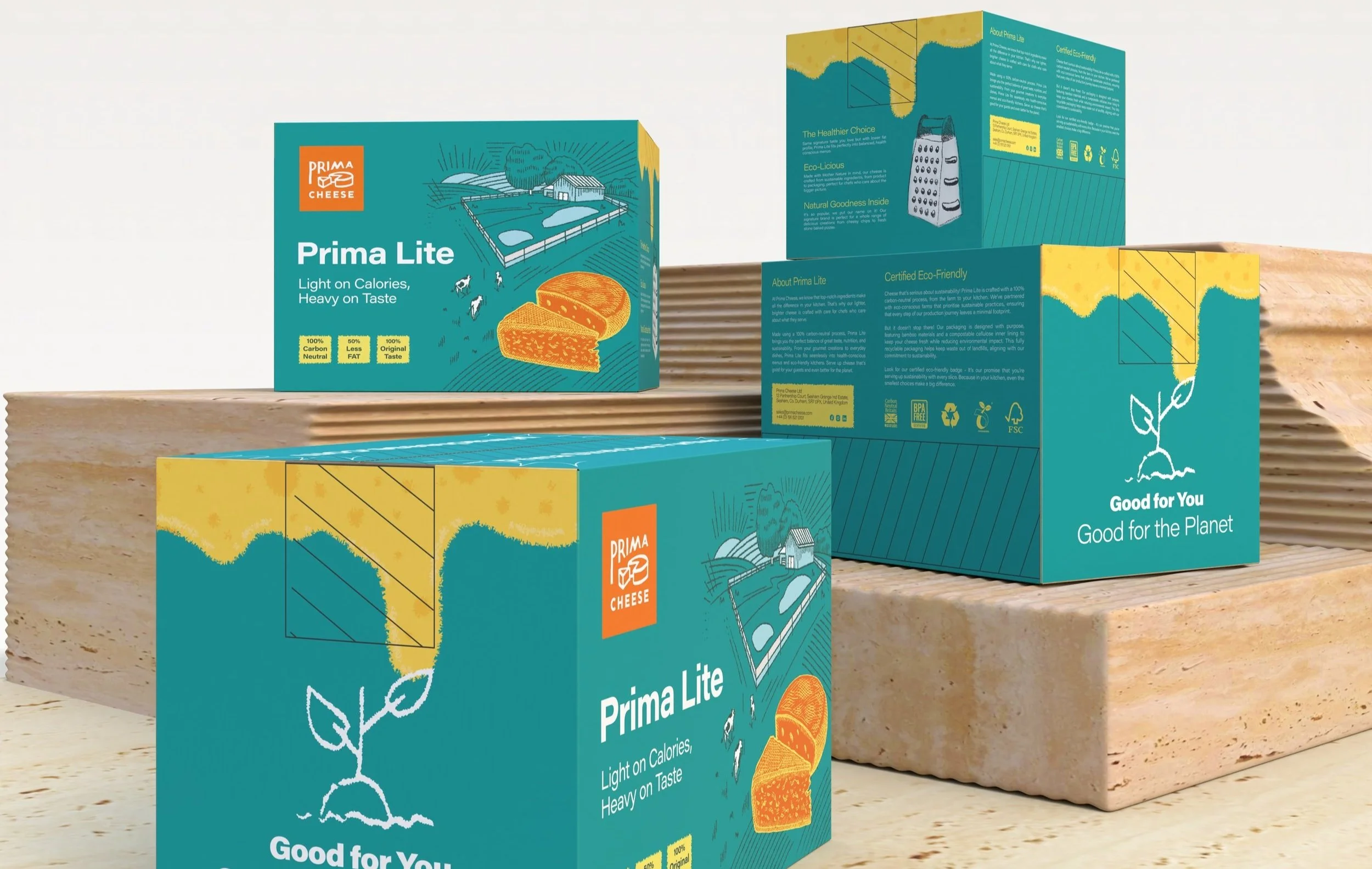
Offering additional versatility, this model provides a fresh take on the Prima brand while maintaining the core principles of sustainability and standout design.
A New Chapter In Cheese
This project allowed me to merge sustainability with premium design, creating packaging that not only protects the product but also tells a powerful eco-conscious story.
By blending innovative materials with Prima’s brand identity, the end result reflects their commitment to the planet while maintaining a strong presence in the B2B market.
Explore the full case study here

